

[CSS] What Is CSS Flexbox? - Container Properties
Flex, Flexbox, Responsive Web, flex-direction, display: flex, align-self, align-content, align-items, justify-content. flex-wrap


![[CSS] What Is CSS Flexbox? - Container Properties](https://cdn.hashnode.com/res/hashnode/image/upload/v1683985546629/e2441d28-1bf1-4ddd-8d04-dcab6eb22344.webp?w=1600&h=840&fit=crop&crop=entropy&auto=compress,format&format=webp)
Introduction
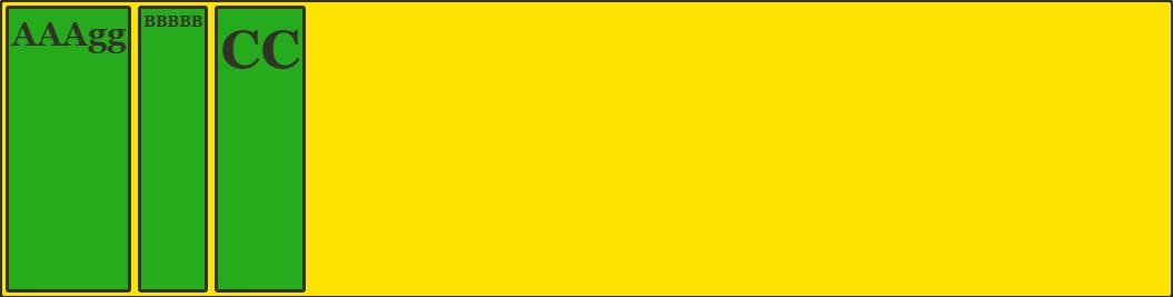
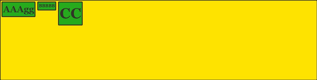
CSS Flexbox is used for building a web layout. It offers space distributions between the items. Imagine a rectangular container that is containing items. You can decide the size of the item, how you want to place them, or if you want to put it in the reverse direction. Flexbox is powerful because it has alignment capabilities.
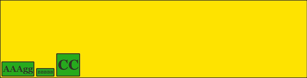
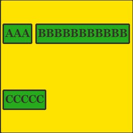
Flexbox Example:
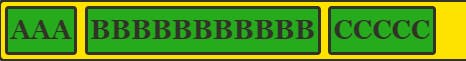
Do you see that the width of each item is different?
One of the characteristics of the flexbox is that the items are arranged horizontally. However, the height depends on the height of the container. But you can set the height manually if you need to set it.
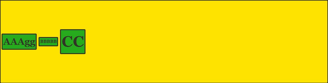
Flexbox:
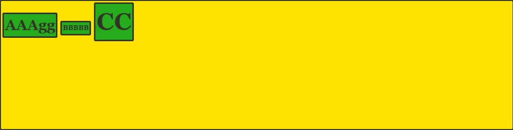
Block:
display: flex
CSS code:
.container {
    display: flex;
}
display: flex means flexbox is adapted on those elements with the class name container. Basically, you are declaring that you are using the flexbox.
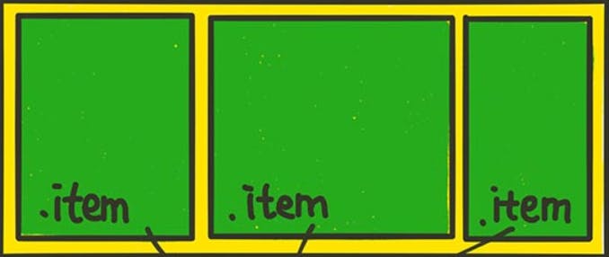
When you create the class names for flexbox, any styles for the container would have a class name "container", and any styles for the items would have a class name "item". It is not a "must", but everyone does it.
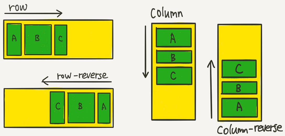
flex-direction
Flex-direction decides the direction of the axis.
There are four(4) values that can go into the flex-direction property.
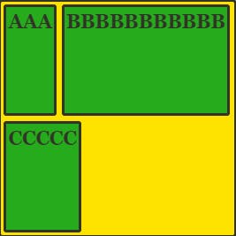
row
column
row-reverse
column-reverse
CSS code:
.container {
    display: flex;
    flex-direction: row;
    flex-direction: column;
    flex-direction: row-reverse;
    flex-direction: column-reverse;
    border: 3px dotted black;
}
Example:
Actual Implementation in real life is when making a responsive website. Responsive website basically refers to the website that changes its layout to the users devices. For example, the website must be able to cover both mobile and pc users. If you set flex-direction: column for mobile users and flex-direction: row for pc users, it is the respnsive web.
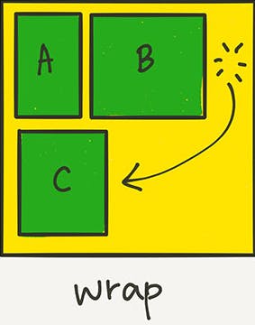
flex-wrap
Imagine if you have put too much food into a container, the food will be spilled over. Similarly, flex-wrap is used to prevent the items overflowing out of the container.
CSS code (flex-wrap: wrap):
.container {
    display: flex;
    flex-direction: row;
    flex-wrap: wrap;
    order: 3px dotted black;
}
CSS code (flex-wrap: wrap-reverse):
.container {
    display: flex;
    flex-direction: row;
    flex-wrap: wrap-reverse;
    order: 3px dotted black;
}

CSS code (flex-wrap: nowrap):
.container {
    display: flex;
    flex-direction: row;
    flex-wrap: wrap-reverse;
    order: 3px dotted black;
}
nowrap is the default. There will be nothing different.
flex-flow
flex-flow is a property that allows you to set flex-direction and flex-wrap at the same time.
CSS code:
.container {
    flex-flow: row wrap;
}
Justify vs. Align
justify-content sorts the items along the main-axis. Main-axis is the x-axis.
align-items sorts the items along the cross-axis. Cross-axis is the y-axis.
Justify-content
Justify-content: start
.container {
    display: flex;
    flex-direction: row;
    justify-content: flex-start;
}

If flex-direction: row, it starts from the left.
If row-reverse, it starts from the right.
If column, it start from the top.
Justify-content: end
.container {
    display: flex;
    flex-direction: row;
    justify-content: flex-end;
}

If flex-direction: row, it starts from the right.
If flex-direction: row, it starts from the bottom.
Justify-content: center
.container {
    display: flex;
    flex-direction: row;
    justify-content: center;
}

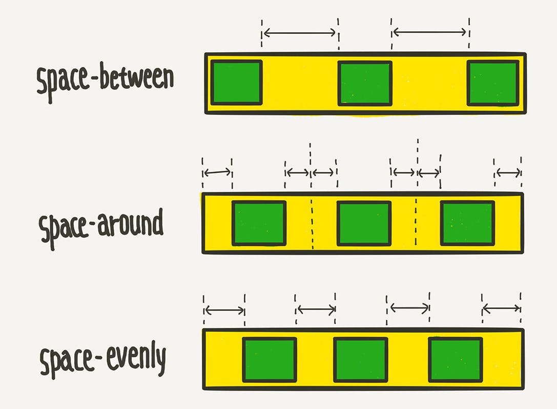
Justify-content: space-between
.container {
    display: flex;
    flex-direction: row;
    justify-content: space-between;
}

Justify-content: space-around
.container {
    display: flex;
    flex-direction: row;
    justify-content: space-around;
}

Justify-content: space-evenly
.container {
    display: flex;
    flex-direction: row;
    justify-content: space-evenly;
}

Please take note that space-evenly is not supported in the Internet Explorer and Microsoft Edge.
Comparison (between, around, evenly):
Align-items
Align-items sorts the items along the cross axis (y-axis).
There are five(5) possible options:
stretch - the item's height stretches to the end of the container
flex-start - sorts the items at the start position
flex-end - sorts the items at the end position
center - sorts the items at the center
baseline - sorts the texts based on the baseline of the text.
align-items: stretch
.container {
    align-items: stretch;
}
align-items: flex-start
.container {
    align-items: flex-start;
}
align-items: flex-end
.container {
    align-items: flex-end;
}
align-items: center
.container {
    align-items: center;
}
align-items: baseline
.container {
    align-items: baseline;
}
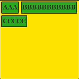
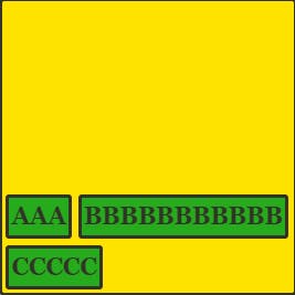
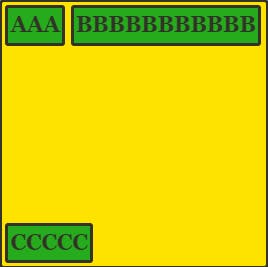
Align-content
Align-content will be used with flex-wrap. It controls the layout when the item is shifted down because of flex-wrap: wrap.
There are seven(7) possible options:
stretch
flex-start
flex-end
center
space-between
space-around
space-evenly
All those options that you can key in as a value are introduced earlier, so I will just show how the layout would look like.
align-content: stretch
Notice that the items are stretched.
align-content: flex-start
All the items are at the start position
align-content: flex-end
All the items are at the end position
align-content: center
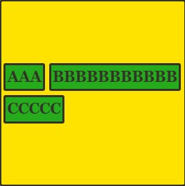
All the items are centered
align-content: space-between
align-content: space-around
align-content: space-evenly
Please take note that space-evenly is not supported in the Internet Explorer and Microsoft Edge.
Align-self
If you only apply those options on one item, use align-self instead of align-content or align-items.